- React
- CSS
- JavaScript
Implement a Simple List Selection Component With React
July 14, 2020 • 2 min read
Useful for navigation menus and routing indication.
Previously I had worked on a list component that needed to change the style of a list item once a user clicks on it. In this post I will show how a component like that can be easily implemented with React. The implementation discussed here can also be applied to navigation menus, or any other component where the user is selecting from a list of choices.
In this example we will implement a breakfast list where the
user can select their favorite breakfast, and display it at the top to them.

1. Build the Static Version
First, let's build a static version of the component. This means no state or stateful logic will be added. Here's what that looks like.
1// App.js23import React from 'react'45export default function App() {6return (7<div className="App">8<h1>List Selection Example</h1>9<ul className="breakfastList">10<li>Pancakes</li>11<li>Cereal</li>12<li>Eggs</li>13</ul>14</div>15)16}
2. Adding State
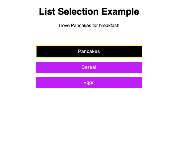
From the photo above we see that we will display a sentence that says what the user likes for breakfast,
and we keep track of what breakfast option was selected. This means we should have state for
the users favorite breakfast and state to keep track of what breakfast option has been selected.
To keep things simple, we will only allow three breakfast options, pancakes, cereal, and eggs.
1// App.js23import React, { useState } from "react";45export default function App() {6const [favoriteBreakfast, setFavoriteBreakfast] = useState(null);7const [breakfastOptions, selectBreakfast] = useState({8pancakes: false,9cereal: false,10eggs: false11});12...13}
All breakfast options are false by default indicating that no breakfast option has been selected.
3. Update Rendering Logic
Now we can utilize the state variables to add to our rendering logic. First we will update
the original JSX rendered by the App component to have proper classnames, and use the selected
breakfast option to apply the right styles to list item that is clicked.
Update JSX
1// App.js2...34return (5<div className="App">6<h1>List Selection Example</h1>7<p>8{favoriteBreakfast9? `I love ${favoriteBreakfast} for breakfast!`10: "Select your favorite breakfast!"}11</p>12<ul className="breakfastList">13<li14className={15breakfastOptions.pancakes16? "breakfastList-listItem breakfastList-listItem--selected"17: "breakfastList-listItem"18}19>20Pancakes21</li>22<li23className={24breakfastOptions.cereal25? "breakfastList-listItem breakfastList-listItem--selected"26: "breakfastList-listItem"27}28>29Cereal30</li>31<li32className={33breakfastOptions.eggs34? "breakfastList-listItem breakfastList-listItem--selected"35: "breakfastList-listItem"36}37>38Eggs39</li>40</ul>41</div>42);
Quick Breakdown
Just want to go a little deeper into the following rendering logic.
1<li2className={3breakfastOptions.pancakes4? "breakfastList-listItem breakfastList-listItem--selected"5: "breakfastList-listItem"6}7>
This is saying that if breakfastOptions.pancakes is true the classname for this list item
will be "breakfastList-listItem breakfastList-listItem--selected". Otherwise, the classname will be
just "breakfastList-listItem". We provide two classnames when a list item is selected, one for the default look
of the list item, and one for the selected version.
Add CSS Styles
Now we will create the styles sheet to apply css styles to our component.
1// styles.css23.App {4font-family: sans-serif;5text-align: center;6}78.breakfastList {9padding: 20px;10border-radius: 5px;11max-width: 400px;12margin: 25px auto;13}1415.breakfastList-listItem {16list-style-type: none;17margin: 15px;18padding: 10px;19background-color: rgb(188, 3, 245);20color: whitesmoke;21letter-spacing: 0.8px;22cursor: pointer;23}2425.breakfastList-listItem:hover {26border: none;27border-bottom: 3px solid rgb(85, 85, 3);28}2930.breakfastList-listItem--selected {31background-color: black;32border: 2px solid yellow;33}
Now that we have our styles, we can import it into our App component.
1...2import "./styles.css";3...
This is possible with a bundler like Webpack. This code is hosted on codesandbox, which handles the bundling for us.
At this point your app should look very similar to the example photo above but without the selection styles applied to any list item.
4. Add Selection Logic
Let's add the logic for selecting a choice from the list. Since all the breakfast choices are initially false, when a user clicks on a list item, we need to set it's corresponding breakfast choice to true and update all other choices to be false. Here's what that logic looks like.
1const invertObjectSelection = (keySelected, objectToInvert) => {2if (objectToInvert[keySelected]) {3return objectToInvert4}56objectToInvert[keySelected] = true78for (let key in objectToInvert) {9if (key !== keySelected) {10objectToInvert[key] = false11}12}1314return objectToInvert15}
This function will be used in the onClick handler we will provide to each list item. This handler will be
provided an event object that it uses to get the value of the breakfast choice. It sets the favorite breakfast,
and then calls invertObjectSelection which will update out state for breakfast choices, and therefore
update the look of our breakfast menu.
1function handleClick(event) {2const selectedBreakfast = event.target.innerHTML3setFavoriteBreakfast(selectedBreakfast)4selectBreakfast(5invertObjectSelection(selectedBreakfast.toLowerCase(), breakfastOptions)6)7}
Now, to call the handleClick above when the user clicks on a breakfast choice, update each list item to
have the handleClick function provided to onClick. It should look like this:
1<li2onClick={handleClick}3className={4breakfastOptions.pancakes5? 'breakfastList-listItem breakfastList-listItem--selected'6: 'breakfastList-listItem'7}8>9Pancakes10</li>
When the user clicks on the Pancakes option or any other option in the list, the handleClick will run and update
the state, therefore updating our UI since we reference state values in the render() function.
Take Away
For this tutorial, I hope you learned how to use stateful logic and boolean values to style and control rendering of your UI. Specifically, I hope it was useful to show you how to build a simple list that can provide users feedback on what they have selected.
To make this more interesting, consider:
- Extending the implementation for any number of items in the list.
- Update the CSS styles to something different than what we have now.
Let me know what you come up with!